Case Study
The Digital Rebirth of Sacred Earth
Adventures
From an outdated and fragmented site to a guided digital experience that now reflects the brand's emotional depth.
Transformation Direction
From clunky navigation to emotionally guided journey discovery.
Client
Demi & Kade
Brand
Sacred Earth Adventures
Website
www.sacredearthadventures.
Services
Website Redesign, UX Strategy, Brand Alignment
Structure
Rebuilt
UX Direction
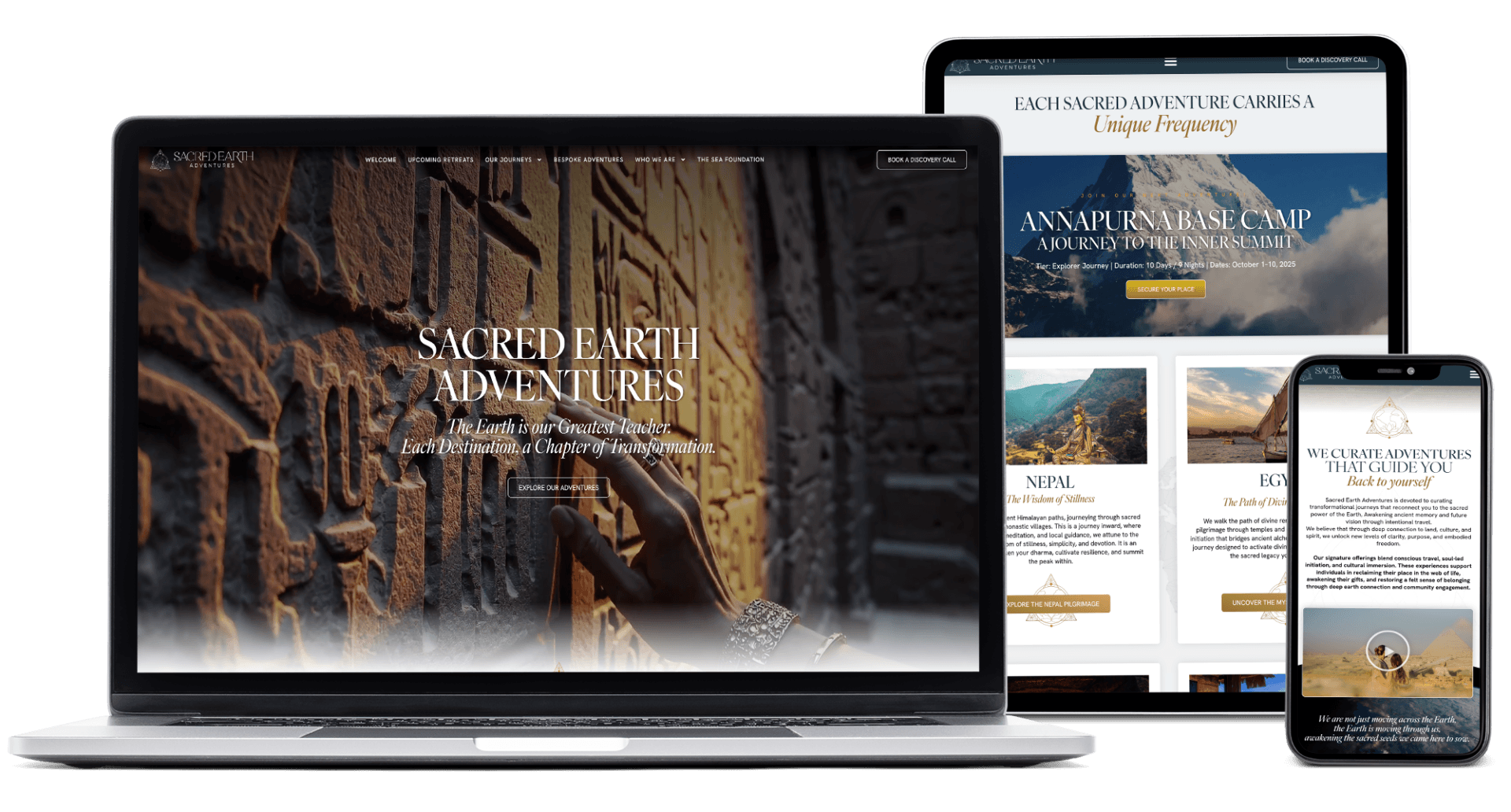
Responsive-First
Content Flow
Narrative-Led
Result
Emotion + Clarity
+0%
Average session duration
+0%
Journey page engagement
0.0x
Pages explored per visit
+0%
Qualified inquiries
How We Think
A Method Behind Every Decision
Not a visual layer added at the end, but a strategic framework that shapes every screen and every moment of decision.
Emotional Clarity
We identify what must be felt in the first seconds and design around that emotional intent.
Strategic Flow
We reduce friction and shape clean pathways so visitors always know what to do next.
Evidence-Driven Craft
We align narrative and design decisions with measurable outcomes, not assumptions.
When a Website Doesn't Match the Depth of the Work
Sacred Earth Adventures was never just about travel. It was about awakening, meaning, and deep personal journey.
The previous site felt operational, not transformational. It was hard to navigate and visually disconnected from the emotional value of the brand.
What We Stepped Into
We identified four structural frictions that were limiting trust, clarity, and aligned action.
The experience was not responsive, so mobile visitors were leaving quickly.
There were no dedicated landing pages for each journey, which limited sharing and campaign clarity.
The site architecture did not guide decision-making; it overwhelmed visitors.
The story existed, but the interface did not give it rhythm, emotional weight, or breathing room.
The result: missed opportunities.
Visitors left before feeling the invitation.
Strategy + Execution
The Mission Was Clear
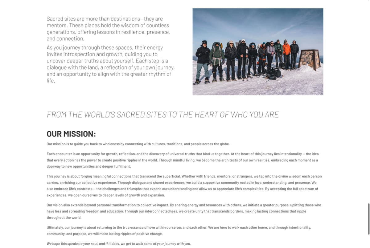
This was never about launching another site. It was about building a digital mirror of the Sacred Earth experience: intentional, immersive, and deeply human.
We focused on emotional clarity, decision flow, and storytelling architecture so every page could carry both trust and wonder.
What We Created
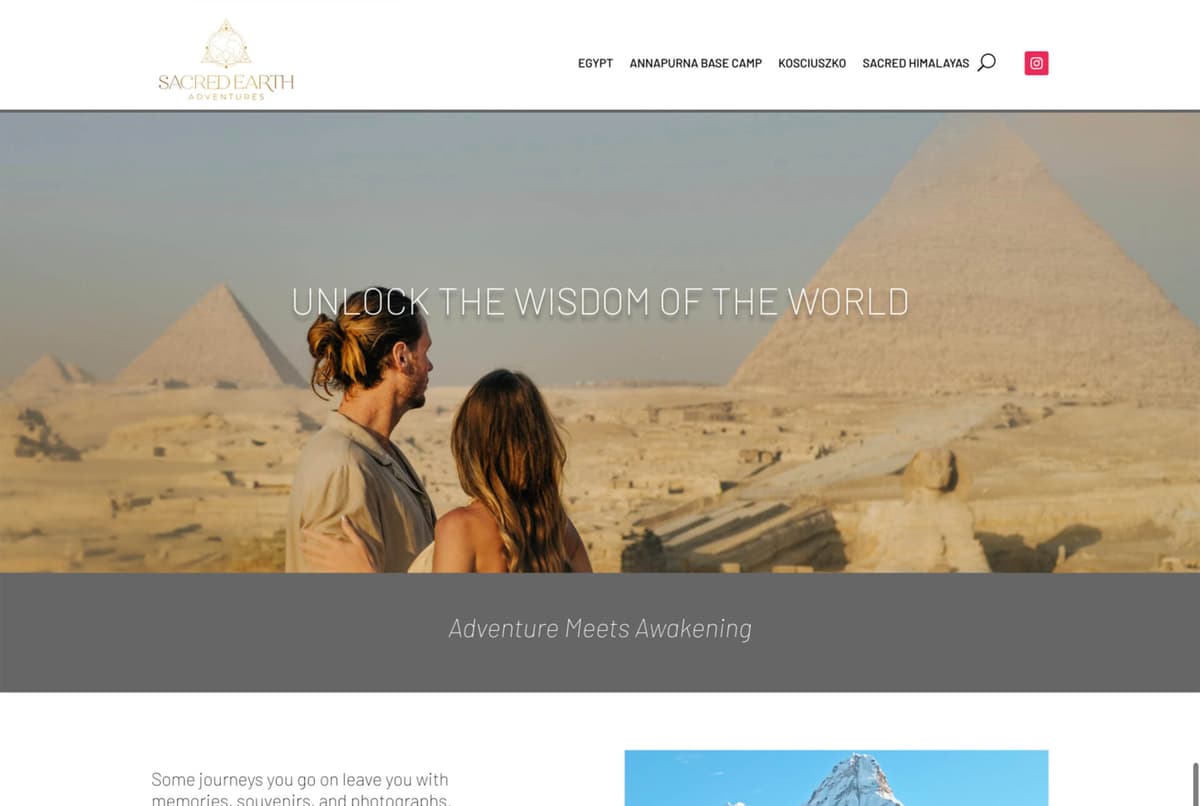
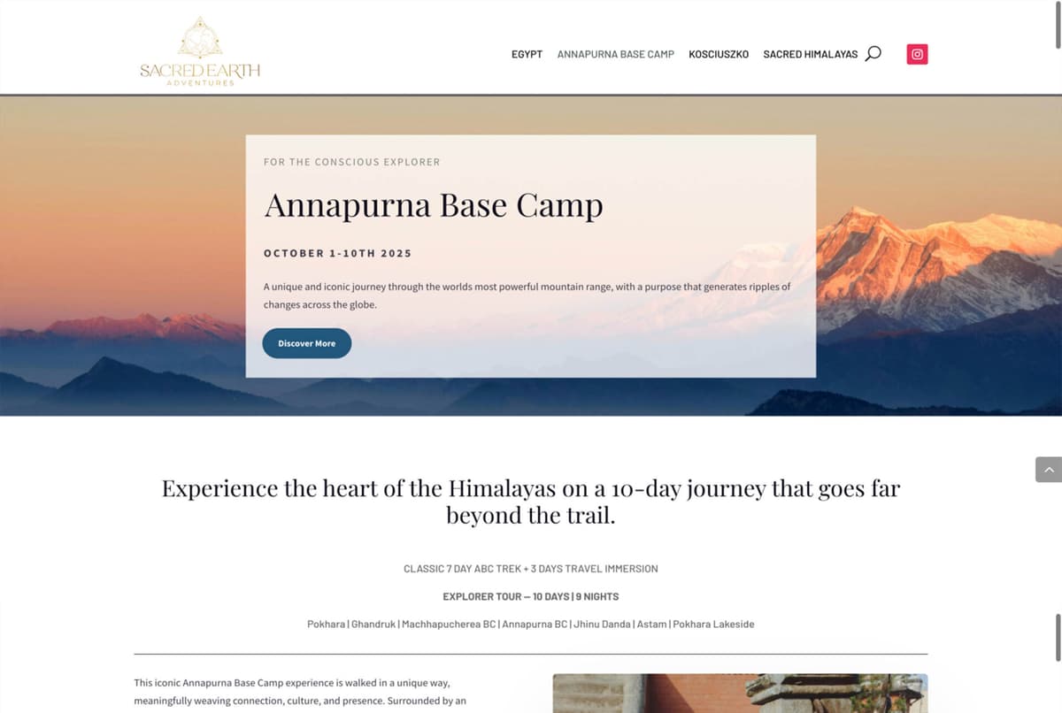
Narrative-led landing pages: We built dedicated pages for each destination, each with distinct voice, pacing, and visual character.
Guided discovery system: We introduced filtering by destination, intention, and timing so visitors can find the right experience faster.
Responsive-first UX: We rebuilt layouts and interactions to feel calm and clear on mobile, tablet, and desktop.
Editorial storytelling rhythm: We replaced heavy text blocks with paced sections, visual anchors, and clearer calls to action.
Hover or hold to pause the scroll
The live website may have changed since this case study was published.
Outcomes
The Shift
The new site is not only easier to use. It now feels emotionally alive.
Visitors are guided from curiosity to commitment through clearer navigation, stronger destination storytelling, and a more grounded visual pace.
It's a site that feels like Sacred Earth.
Visitors now spend longer on key pages and explore more journeys before exiting.
Every offer now has a linkable, campaign-ready page for email, paid media, and social.
The new visual pace increases emotional connection without creating cognitive overload.
The platform is now scalable for future destinations and offering expansion.
At Hearttale, a website is never the whole work.
We build the strategy, message, and experience around it.
Digital spaces where the people called to your work can experience your value before the first conversation.
When your digital presence expresses your truth clearly, it does more than inform. It helps people trust you.
Before / After
A Clear Transformation Layer
Beyond aesthetics, this project shifted how visitors understand offers, trust the brand, and move through decisions.
Area
Before
After
User Journey
Fragmented navigation and unclear next steps.
Guided flow from curiosity to action.
Offer Visibility
Journeys were difficult to promote individually.
Every destination now has a dedicated campaign-ready page.
Emotional Experience
Brand depth existed, but felt hidden by the interface.
Storytelling now feels intentional, spacious, and immersive.
Scalability
Structure made future growth harder to sustain.
Modular architecture supports expansion with consistency.
Client Voice
“For the first time, our website feels like us. People now understand our journeys before they even speak with us.”
Demi & Kade, Founders of Sacred Earth Adventures

What if this was your story?
Every impact you've read here started with a conversation.
A need for clarity. A new growth chapter.
If this resonates with your work, let's shape your next digital chapter with intention.